Animated gifs for digital book covers
I chaired a Sydney Writers’ Festival panel this year on book cover design.
Stephen Banham (founder of Melbourne design studio Letterbox) described designing the cover for his latest book Characters
so it was graphically bold, and easily recognisable where most people will buy
it – online. Below is a screenshot of the book at icon size from Banham's site, and a larger image taken from imprint magazine's review of the book:
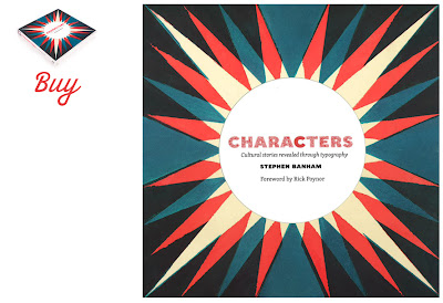
What appeals most is that holding the book object, or at least seeing a larger screen version, the slight misalignment and texture from the printing is revealed – an element of delight still awaits the viewer of the printed book.
I've been in conversation with a UTS colleague Chris Caines about the potential of using animated gifs as digital book covers. Current eBook software seems to skip the option to develop a 'cover' and take readers straight to a title page with the title and author appearing as text on a blank or flat colour background. Digital platforms (whether it's a digital book store viewed via computer or an app 'library' on a tablet) could easily offer what great book covers achieve so well – an evocative and engaging image that sets the mood and tone of the book. I'm not advocating a noisy and visually complex animation attached to every ebook. But there is space for play – to experiment with how visual language could draw a reader to a book, and add to the mood/tone of the work as a whole – again, this is what great book design does.
I cringe at the constant overkill of anything Banksy, but these animated gifs are a great example of how simple movement could bring an image 'alive' – particularly thinking about how book covers could be presented online. See also Duane Michals animated gifs for a more narrative-driven animated sequence:

these hypnotic looping gifs of a single person (thanks to Chris Caines for these) and these surreal Japanese gifs that are almost a Haruki Murakami cover already:

On another note, the website for Banham's book also has pockets of extra information – behind the scenes pics (as if from a film shoot), a location map to show where many of the images for the book were shot, and 'stories' sections for fans to contribute their own content. It possibly seems overdone to someone who has never met a typography fanatic, but for those who care (students and hardcore type fans) this is no doubt a valuable resource. It extends the web site beyond pointing to the book, presenting the type of process-based content that is not broadly interesting enough to include in the printed book but appropriate for a website.
Supplementary online content (paratext) is increasingly part of book publishing. It's a marketing tool, engaging potential buyers with the content when they stumble upon it online, or are pointed to it by a blog or reviewer, hopefully enough for them to purchase a hard copy. Thames and Hudson has potentially paid for the production of this web material – although it's less expensive to 'publish' this image heavy content online, it still requires hours of design/production time and resources. It's a marketing tool, engaging potential buyers with the content when they stumble upon it online, or are pointed to it by a blog or reviewer, hopefully enough for them to purchase a hard copy. Ellen Lupton is another graphic design writer whose books have a website that gives part of the content online – enough for some people to not bother buying the book, but presumably not so much that it makes it unprofitable for the publisher.

What appeals most is that holding the book object, or at least seeing a larger screen version, the slight misalignment and texture from the printing is revealed – an element of delight still awaits the viewer of the printed book.
I've been in conversation with a UTS colleague Chris Caines about the potential of using animated gifs as digital book covers. Current eBook software seems to skip the option to develop a 'cover' and take readers straight to a title page with the title and author appearing as text on a blank or flat colour background. Digital platforms (whether it's a digital book store viewed via computer or an app 'library' on a tablet) could easily offer what great book covers achieve so well – an evocative and engaging image that sets the mood and tone of the book. I'm not advocating a noisy and visually complex animation attached to every ebook. But there is space for play – to experiment with how visual language could draw a reader to a book, and add to the mood/tone of the work as a whole – again, this is what great book design does.
I cringe at the constant overkill of anything Banksy, but these animated gifs are a great example of how simple movement could bring an image 'alive' – particularly thinking about how book covers could be presented online. See also Duane Michals animated gifs for a more narrative-driven animated sequence:


On another note, the website for Banham's book also has pockets of extra information – behind the scenes pics (as if from a film shoot), a location map to show where many of the images for the book were shot, and 'stories' sections for fans to contribute their own content. It possibly seems overdone to someone who has never met a typography fanatic, but for those who care (students and hardcore type fans) this is no doubt a valuable resource. It extends the web site beyond pointing to the book, presenting the type of process-based content that is not broadly interesting enough to include in the printed book but appropriate for a website.
Supplementary online content (paratext) is increasingly part of book publishing. It's a marketing tool, engaging potential buyers with the content when they stumble upon it online, or are pointed to it by a blog or reviewer, hopefully enough for them to purchase a hard copy. Thames and Hudson has potentially paid for the production of this web material – although it's less expensive to 'publish' this image heavy content online, it still requires hours of design/production time and resources. It's a marketing tool, engaging potential buyers with the content when they stumble upon it online, or are pointed to it by a blog or reviewer, hopefully enough for them to purchase a hard copy. Ellen Lupton is another graphic design writer whose books have a website that gives part of the content online – enough for some people to not bother buying the book, but presumably not so much that it makes it unprofitable for the publisher.

Comments